
“Design is not just what it looks like or what it feels like. Design is how it works.”
Steve Jobs
As I initiate my layout projects, I begin by organizing my initial thoughts, sketches, and ideas to understand what I aim to present. My designs are a reflection of my illustrative style as they further my clean, minimalistic designs. My book cover graphics strive to interpret and emphasize the story’s themes and ideas.
Book Covers.
-
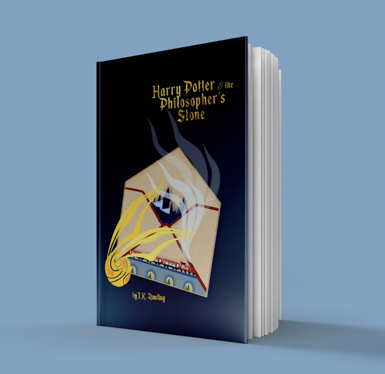
Harry Potter & the Sorcerer's Stone.
The illustrations show the start of Harry Potter's journey in the magical world beginning with his offer letter.
-

Alice's Adventures in Wonderland.
I designed a fractured Cheshire Cat to represent his disappearing and reappearing act in the story.
-
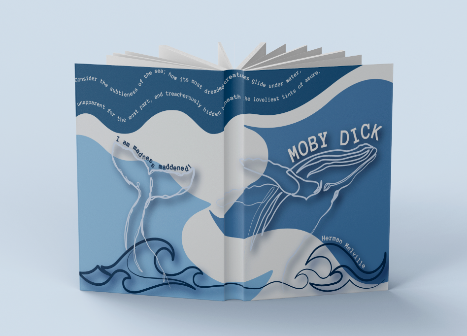
Moby Dick.
The design shows the voyage across the ocean as Ishmael chases the white whale he considers to be evil.
-
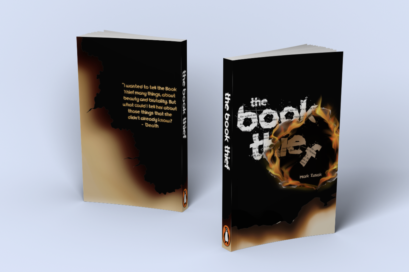
The Book Thief.
The flames represent the motif of suppressing knowledge in the story through the burning of books.
Deliverables.
-

Business Cards.
-

Manor College Stickers.
-

Environmental Bookmarks.
-

NYC Met Gala.
Posters.
-
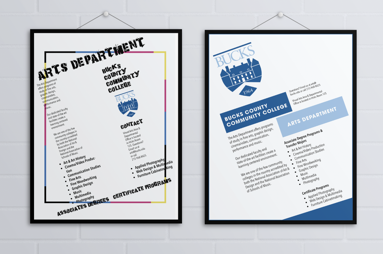
Arts Department.
Two posters for Bucks County Community College Arts Department. Grunge style (left) vs. Bauhaus style (right).
-

PNC Bank.
Two minimalistic style posters that have the bank colors into the design and easy to read information.
-

Bluebeard's Castle Opera.
An illustrative poster depicting the heartbroken wife who discovers Bluebeard's previous wives trapped inside his castle.